
Introduction: The Unseen Power of Your Walls
We spend countless hours and significant resources curating our homes—choosing the perfect sofa, the ideal lighting, the most comfortable rug. Yet, often, the element with the most profound psychological impact is treated as an afterthought: the art on our walls.
Your walls are not blank canvases waiting for decoration; they are the backdrop to your daily life. The imagery and colours you choose for them do more than fill space; they actively influence your emotions, stress levels, and even your productivity. This isn’t just artistic theory; it’s a science rooted in colour psychology.
Understanding this connection is the secret to transforming your house from a place you simply live into a sanctuary that actively supports your well-being. And in the modern world, the most powerful tool to harness this effect is printable art. It offers the agility to experiment with these psychological principles without the commitment or cost of traditional art, allowing you to tailor your environment to your exact emotional needs.
This guide will demystify the science of colour and provide a practical framework for selecting digital wall art that doesn’t just look good—it makes you feel good.
Part 1: The Science of Sight and Emotion – Why Colour Gets Under Our Skin
Before we dive into specific colours, it’s important to understand why they hold such sway over us. The reaction is not merely cultural; it’s biological and deeply primal.
- The Biological Response: When light enters our eyes, it doesn’t just go to the visual cortex to be processed as imagery. Wavelengths of light, which we perceive as colour, also travel to the hypothalamus, a key part of the brain that governs our endocrine system and influences hormones, body temperature, hunger, and sleep cycles. A vibrant red can literally trigger a slight increase in heart rate and adrenaline, a throwback to its association with danger and urgency. A cool blue, conversely, can prompt a calming response.
- The Primal Connection: For our ancestors, colour was a vital survival tool. Bright colours in nature often signified food (ripe fruit, edible plants) or danger (venomous creatures). Dark, muted colours offered camouflage and shelter. These deep-seated associations are still hardwired into our neurology, influencing our comfort levels in different environments.
- The Cultural Layer: On top of our biological wiring, we have cultural conditioning. In Western cultures, white is associated with purity and weddings; in some Eastern cultures, it is the colour of mourning. While this guide focuses on near-universal psychological traits, it’s worth considering your personal and cultural associations with colour.
The Printable Art Advantage: This biological and emotional impact/ Neurodecorating means your choice of wall art is a functional decision, not just an aesthetic one. The ability to choose, download, and print art that aligns with your desired mood for a room is like having a remote control for your environment’s atmosphere.
Part 2: The Colour Palette of Your Mind – A Room-by-Room Guide
Let’s break down the psychological profiles of key colours and how you can leverage them with wall art in specific rooms of your home.
The Calming Cohort: Blues, Greens, and Soft Neutrals
This family of colours is universally recognized for its soothing properties. They are ideal for rooms dedicated to relaxation and rejuvenation.
- Blue: The Universal Soother
- Psychology: Blue is consistently linked to feelings of calm, serenity, and stability. It can lower heart rate and blood pressure, and even suppress appetite. It promotes mental clarity and a sense of peace.
- Best For: Bedrooms, bathrooms, home offices (for focused, non-stressful work), and meditation spaces.
- How to Use It in Art: Don’t just think of solid blocks of colour. The psychological effect comes from the scene and hue.
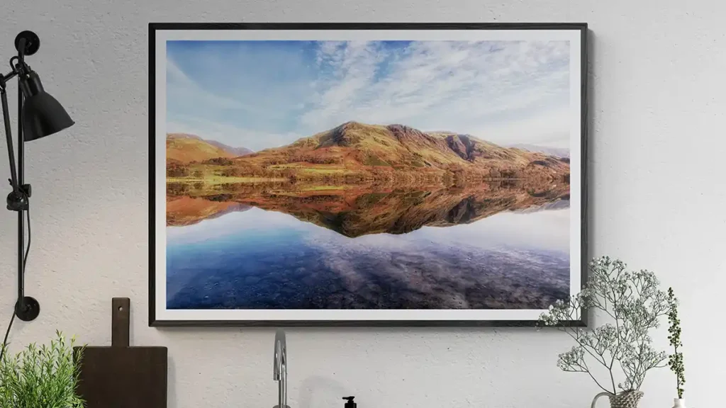
- Our Recommendation: A large, serene landscape photograph from our Lake District collection, featuring reflective water and vast skies, leverages blue’s calming power perfectly. It creates a “window” to a peaceful vista, literally expanding the feeling of space and tranquility in your room.
- Alternative: Abstract art with dominant cool blue and grey tones can create a modern, Zen-like atmosphere.
- Green: The Balancer
- Psychology: As the colour of nature, green is inherently restorative and balancing. It symbolizes growth, harmony, and safety. It’s the easiest colour for the human eye to process, reducing eye strain and creating a sense of equilibrium. Green encourages a “reset” of the mind.
- Best For: Living rooms, home offices, studies, and any space where you want to feel grounded and at ease.
- How to Use It in Art:
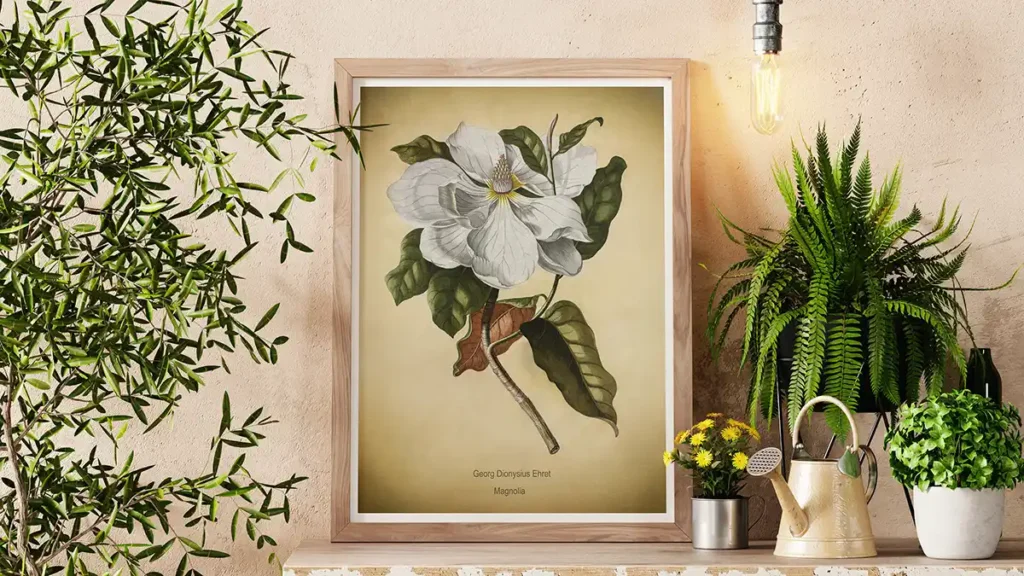
- Our Recommendation:Vintage botanicals are a quintessential way to harness green’s power. The structured, scientific detail of the prints provides visual order, while the green tones connect you to the natural world, fostering a sense of clean, organized calm. They are perfect for creating a focused yet relaxed study or a fresh, uplifting living area.
- Alternative: Forestscapes or lush, abstract organic forms.
The Energizing Ensemble: Reds, Oranges, and Yellows
These are the extroverts of the colour wheel. They command attention, stimulate the senses, and promote activity. Use them strategically—they are powerful in small doses.
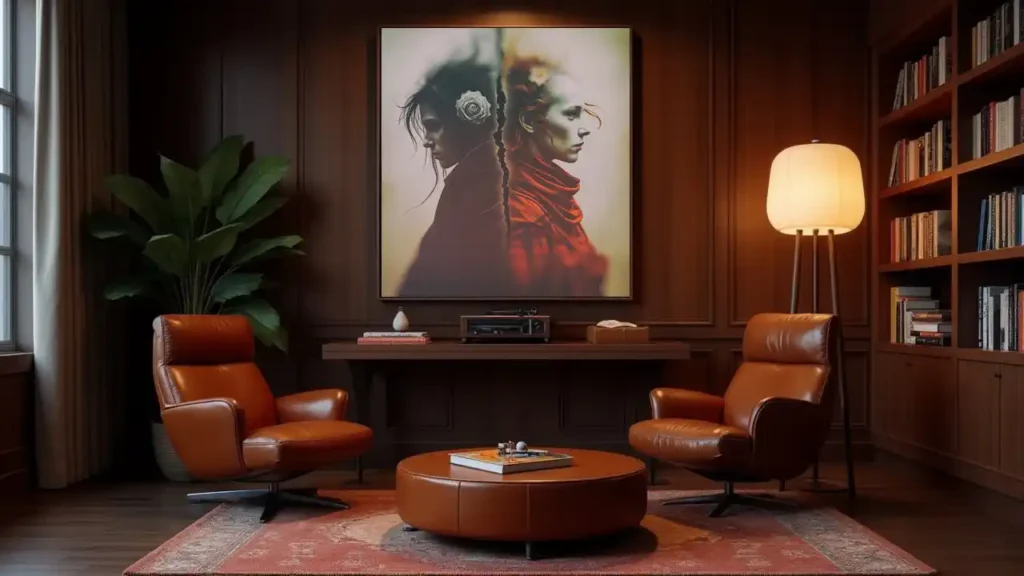
- Red: The Stimulant
- Psychology: Red is the colour of passion, energy, and excitement. It raises a room’s energy level, increases heart rate, and can even stimulate conversation. However, it can also be associated with aggression and impatience if overused.
- Best For: Dining rooms (to stimulate appetite and conversation), social spaces like game rooms, or as a powerful accent in a hallway or entrance.
- How to Use It in Art: A little goes a long way. Use red as a dominant colour in a piece only if you want the room to feel intensely dynamic.
- Our Recommendation: A piece from Duncan Young’s Effervescence collection that uses a bold splashes of red in an otherwise monochrome design. This provides the energizing “pop” without overwhelming the space.
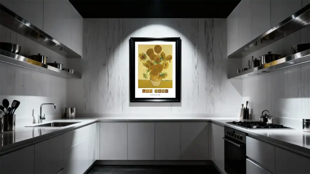
- Yellow: The Optimist
- Psychology: Yellow is the colour of sunshine, happiness, and intellect. It stimulates mental activity and can create a feeling of optimism. However, bright yellows can be overwhelming and are known to cause feelings of frustration in large quantities.
- Best For: Kitchens, breakfast nooks, bathrooms, and dark hallways. It’s best used in spaces where you spend shorter amounts of time.
- How to Use It in Art: Muted, buttery yellows and golds are safer and more sophisticated than neon brights.
- Our Recommendation: A vintage poster with warm, golden-yellow hues can evoke feelings of nostalgia and joy without being overbearing.
The Mindful Middle Ground: Purples, Neutrals, and Black & White
This group offers sophistication, depth, and clarity.
- Black & White: The Clarifiers
- Psychology: This is not the absence of colour, but a powerful statement of contrast. Black and white art is perceived as sophisticated, timeless, and clear. It eliminates the emotional influence of colour, allowing the subject matter, composition, and texture to take center stage. It promotes mental focus and a sense of order.
- Best For: Home offices, studies, modern living rooms, games rooms, man caves and galleries. It’s for those who want a clean, uncluttered, and powerful aesthetic.
- How to Use It in Art: This is where subject matter becomes paramount.
- Our Recommendation: The entire Rex & Co collection is built on this principle. A bold, black and white poster of a wolf or a geometric design makes a definitive statement. It conveys strength, sophistication, and focus, making it ideal for a home office where you need to eliminate distraction and project confidence.
Part 3: Putting It Into Practice – A Step-by-Step Guide to Choosing Your Art
Understanding colour theory is one thing; applying it to your own space is another. This practical, step-by-step framework will help you move from inspiration to execution, ensuring the art you choose delivers the emotional impact you desire.
Step 1: Define the Room’s “Emotional Mission”
Before you look at a single piece of art, ask yourself: What is the primary purpose of this room, and how do I want to feel when I’m in it?
This is the most critical step. The art should serve the room’s function. Jot down 3-5 feeling words for the space.
- Home Office: Focused, creative, organized, energized (but not stressed).
- Bedroom: Calm, safe, serene, restorative, intimate.
- Living Room: Welcoming, balanced, inviting for conversation, uplifting.
- Dining Room: Social, vibrant, appetizing, warm.
- Hallway/Entryway: Inspiring, expansive, a bold first impression.
Step 2: Select Your Dominant Colour Palette
Now, cross-reference your “feeling words” with the colour psychology from Part 2.
- If your mission is CALM: You are a Sanctuary Seeker and in the territory of blues, soft greens, and gentle greys. Look for art with these dominant hues.
- If your mission is ENERGY & SOCIABILITY: Lean into terracotta, warm yellows, and deep reds as accent colours. A full wall of red might be overwhelming, but a pieces with a powerful splash of these colours can be perfect.
- If your mission is FOCUS & CLARITY: Black and white is your powerhouse. It cuts through visual noise and demands attention without the emotional volatility of colour.
Pro Tip: Don’t forget about your existing furniture and decor. Your art should complement, not clash with, your room’s permanent fixtures. Use your chosen colour palette to create a harmonious flow.
Step 3: Analyze the Subject Matter and Style
Colour doesn’t exist in a vacuum. The subject matter of the art carries its own psychological weight. A screaming face rendered in calm blue will still feel unsettling. Ensure your subject reinforces your colour choice.
- For Calm (Bedroom, Bathroom):
- Ideal Subjects: Serene landscapes, still waters, gentle botanicals, abstract fluid forms.
- Styles: Photography, soft watercolours, minimalist line art.
- Our Suggestion: A Michael Paul Bennett landscape pairs the calming power of blue with the restorative subject of nature for a double effect.
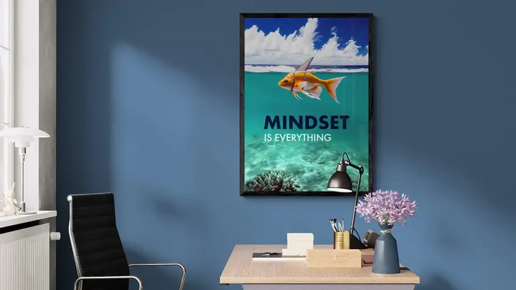
- For Focus and Sophistication (Office, Study):
- Ideal Subjects: Architectural prints, geometric patterns, strong animal portraits, typographic art prints.
- Styles: High-contrast photography, graphic design, vintage illustrations.
- Our Suggestion: A Mindset is Everything print uses motivation blues and an inspiring message to encourage productivity.
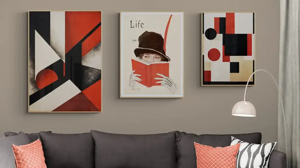
- For Balance and Harmony (Living Room):
- Ideal Subjects: Balanced landscapes, curated gallery walls, botanical collections.
- Styles: A mix that feels intentional, not chaotic.
- Our Suggestion: A set of vintage botanicals creates a sense of order and natural harmony, perfect for a living space.
Step 4: Consider Size, Scale, and Placement
The physical presence of the art changes its impact.
- Large, Single Piece: Creates a focal point and induces a feeling of expansiveness and calm. Ideal for behind a sofa or over a bed.
- Gallery Wall: Energizes a space, tells a story, and showcases personality. Better for hallways, stairwells, or a large wall.
- Small, Intimate Pieces: Create moments of discovery and comfort. Perfect for a reading nook or a bathroom.
The Printable Art Advantage Here is Key: You are not locked into a predetermined size. You can buy a single digital file and test-print it at different scales (e.g., A4 on your home printer) to see what feels right before committing to a large, professional print. This flexibility removes the risk and guesswork.
Step 5: The Final Check – Your Gut Reaction
After all the analysis, do one final check. Look at the art you’ve selected based on this process.
Does it genuinely bring you joy? Does it evoke the feeling you wrote down in Step 1?
Science is a guide, not a dictator. Your personal connection to a piece of art will always be the most important factor. If a vibrant, “energetic” piece of art makes you feel calm because you love it, then it’s the right piece for you.
Conclusion: Your Home, Your Sanctuary
The art you hang on your walls is a continuous, silent conversation with your subconscious. It’s not mere decoration; it’s a tool for well-being. By understanding the principles of colour psychology, you can move from randomly filling blank space to intentionally curating an environment that supports your mood, goals, and mental health.
The power of Digital Prints and the beauty of printable art is that it democratizes this process. It gives you the freedom to experiment, to adapt, and to personalize your space without a massive financial commitment. You are no longer just a consumer of art; you are the designer of your own emotional landscape.
Start small. Choose one room. Define its mission. Find one piece of art that aligns with that goal. You will be amazed at the difference a single, intentional print can make. Your sanctuary is waiting to be created.
Ready to transform your space? Explore our collections designed with mood in mind:
- Find focus and power in our Rex & Co Collection.
- Cultivate calm with our Lake District Landscape Photography.
- Introduce harmonious order with our Vintage Botanicals Collection.
Sources & Further Reading:
- American Psychological Association: “The Power of Light” – On the non-visual effects of light (and thus colour) on human physiology.
- National Institutes of Health (NCBI): “Evolutionary View of Color Vision” – On the evolutionary roots of our colour perceptions.